For someone like me who started learning to draw rather late in life, art is oftentimes a puzzle. As I first went through drawing lessons one by one, and now as I’ve been reviewing those early lessons one by one, that’s how the learning process goes: one thing at a time.
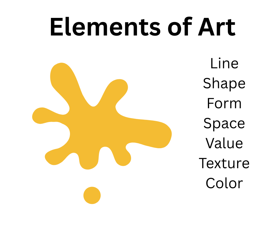
I can still recall with pride how accomplished I felt when I first learned — and could recite from memory — the essential elements of art:
- Line
- Shape
- Form
- Space
- Value
- Texture
- Color
I felt like a true art student as I wrote these in my first sketchbook!
Knowledge, however, is two-fold. We may know something intellectually, but we don’t fully understand the concept until we know it in practical terms. In other words, until we know how to use the concept or put the ideas into practice.
I recently signed up for a 100-Day Project. This is an annual challenge that involves not just art and artists, but any sort of creative process, discipline, or self-improvement objective. The idea, as the name suggests, is to challenge ourselves to do something specific for 100 days.
Because I was just getting back into my regular art practice, and because I wanted to work on key fundamentals, I chose “100 Days of Shapes and Forms” — tasking myself with making 100 sketches of various geometic forms. Now, I don’t necessarily do one sketch each day. I have a life, I’m studying other aspects of art, and other obligations sometimes get in the way. So, at this point, I’m only about a quarter of the way through the project. Does it matter? Not really. I will complete my sketches in my own time.
In previous days I’ve focused on one thing or another, but with today’s sketch I truly made a conscious effort to consider all the different elements of art, and to the best of my ability to put them all together, much like taking pieces of a jigsaw puzzle and assembling them into a whole.
The sketch is not great. To me, it’s still a bit messy, but there are some good things here that I want to point out — primarily for my own benefit. I want to compliment myself on some of the things I did.
So, let’s take the elements of art and look at them one by one, shall we? Well, first, let’s take a look at today’s sketch: a prism with a sphere beside it.
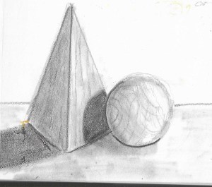
Like I said, it’s not great. I know this, and I know, too, that this simple sketch represents progress. We just have to know where to look!
Line
The first fundamental element of art is line. I began this drawing not in my usual haphazard fashion, but by carefully placing lines on the page. I started with the center, downward line of the prism, and I used a ruler to ensure a clean, straight line. I’m not good with rulers, but I took my time, and I managed. Using a 4H pencil to keep my lines as light as possible, I added the rest of the lines to complete the prism, carefully noting the angles at the base.
I then drew the circle — in the wrong place. So, I erased and re-drew it as you see it above, with the sphere slightly in front of the prism. Somewhere in the studio I have a “circle template”, but I have no idea where it is. I would have used it if I’d had it. As it was, I just made my best attempt at drawing the circle free-hand. It could be better, and I intend to dig out that circle template and use it for many of my future “Shapes and Forms” sketches.
LESSON LEARNED: Use tools when necessary. There’s nothing wrong with using rulers, protractors, and other drawing templates, especially when we’re trying to create accurate drawings. And it’s good to use erasers, too. If you’ve drawn something wrong, change it!
Shape
The lines I drew led to simple shapes — the second fundamental element of art. If you were to look at only the basic line drawing, you would have seen two shortened triangles and an adjacent circle. Shapes are simple. They are two dimensional. My triangular shapes looked good; my circle was not quite so good — again, the difference between using a ruler and drawing free-hand.
LESSON LEARNED: A repeat of the first lesson. Yes, drawing tools are helpful. Use them! This is obvious, I’m sure, to most of you. In my naive understanding of what “being an artist” meant, I somehow assumed that “real artists” didn’t need templates and other tools. I saw it as almost a form of cheating in art. I know better now.
Form
For me, this is where “art” begins in our drawings. When we begin to apply shading, when we look at the lights and shadows, we see our two-dimensional shapes becoming three-dimensional forms. This is still a weak area for me. My shading and blending techniques still need a lot of work, but with each sketch or drawing, I’m more aware of the process by which we give “form” to our basic “shapes”.
LESSON LEARNED: It’s good to know our weak areas so we can focus on those. Creating form through shading techniques requires keen observation. We need to look closely to see how the light is falling on the objects we’re drawing. Only then can we realistically create the shapes.
SPACE
This is one of those “art elements” i’ve never really noticed as much as I should. This is why in my initial drawing I had my circle placed much too far to the right, leaving a space between the prism and the sphere. Oops! There was no space between them in my block set-up. To correct my mistake, I had to look closely at the spatial set-up. I had to see the slight overlap between the sphere and the prism. I had to mentally note how much space was involved with the base of the prism, too. I had to look at the “space” behind my blocks.
LESSON LEARNED: There are positive spaces — the areas we draw — and negative spaces — the areas we don’t draw. Both are important. In fact, sometimes we spaces we don’t draw make a lot of difference.
VALUE
Value is generally considered to be the single most important element in art. Value represents the lightness or darkness of things, which is a way of saying that value is based upon the principles by which we see. Without light, we would see nothing! Value is the critical element that makes it possible for us to show three dimensions on two-dimensional surface.
We’re taught that we should have a FULL RANGE OF VALUES in our art, so I wanted to apply this concept as best i could, even with a simple sketch of two wooden blocks. I did this primarily by trying to exaggerate a bit. I looked for the dark places: the sphere’s shadow on the prism, and the shadow slightly below the sphere, and the shadow of the prism. I then looked for the light: the relatively lighter right face of the prism and the small highlight on the sphere. Using first a 2B and then a 4B pencil, I attempted to place the shading in the proper places, avoiding the highlight, and to then do a bit of blending.
Here is how my sketch looked at that point:
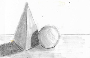
LESSON LEARNED: Keep working on shading and blending! This is a very important element in drawing, so practice, practice, practice. And trust what you see! As I darkened the shadow of the sphere on the prism, I thought it was “wonky-looking”. Then, when I stepped back, I realized — to my surprise and delight — that it actually looked like the shadow of a sphere!
TEXTURE
I nearly put my sketchbook aside at this point. I’d drawn my forms for the day. Good job, But wait! Something was missing. I hadn’t made any attempt at creating the wooden texture of these two blocks. Could I do it? Of course! Maybe not as skillfully as some artists could do, but I could at least add that piece of the puzzle.
So, using an HB pencil, I attempted to “suggest” the lines I saw in the wood. Because my shading was a bit splotchy, the effects I created weren’t completely successful, but I had the right idea, and adding a bit of texture did improve the drawing.
Here it is again:
It’s still flawed, still not much to look at, but adding the texture to the blocks did give it a more “finished” look. Or, at least, it gave me a more “finished” sense of satisfaction.
LESSON LEARNED: Texture is an easily overlooked element when we’re making quick sketches, but adding texture is an important step toward completing any drawing or sketch.
COLOR
And what about color as an element of art? There is no color in this black-and-white graphite drawing, or maybe we can just say that the “black-and-white” are neutrals that take the place of color. Obviously color is important in art, and a monochromatic black and white color scheme still counts!
LESSON LEARNED: Color is eye-catching, of course, but black-and-white graphite drawings can be beautiful and eye-catching, too. As art instructors often say, “Color gets all the credit, but it’s value that does the work.”
For me, this drawing represented a lot of growth, perhaps not growth in my skills, but definitely growth in my attitude. I’m taking my graphite drawings — and sketches — more seriously now. I see them not as “attempts at learning to draw” but as opportunities to develop various skills and make use of knowledge I’ve gained over the years. I’m taking more time — time to ensure that my initial lines are correct, time to erase obvious mistakes, time to choose the right pencils and time to carefully observe what I’m drawing.
Each of the elements of art is another piece in the “how to draw” puzzle, and it feels good to know — and use — them as I put it all together in my drawing and sketching.

Really enjoy this detailed analysis of your work!
LikeLiked by 1 person
Thanks. Lately I’ve been doing more “simming” than “arting” LOL. I am getting my studio re-organized, though, and that will be good.
LikeLiked by 1 person
Oh, I hope you’re enjoying Sims! I seem to be on a break from Sims–maybe this summer I’ll get back to them!
LikeLiked by 1 person
It’s been so long since I’ve played, and I’ve obviously missed out on a lot. I just learned this morning that there is an “infant” stage, so I had to go in to my families (I’m still a rotational player) and age all the newborns up to infants LOL. It’s an adorable life stage! Now, I’m wondering what else I’m unaware of! It’s fun rediscovering the game.
LikeLiked by 1 person
The new attraction system is pretty cool, too–so are the bonus traits! I love how the game learns from the activities our Sims do (either autonomously or directed) and now forms their personality based on that!
LikeLiked by 1 person
The relationship dynamics are still a bit of a puzzle to me, but I do like a lot of the changes.
LikeLiked by 1 person
The elements of composition nicely explained. But I’ve never successfully taught—or graded!— composition from a list. It’s always been better done by suggesting a little change over and over again
LikeLiked by 1 person
Good point. Coming back to my art practice after a long, long hiatus has been an interesting process, so using a little “checklist” has been a good reminder for me, especially with the simple drawing exercises I’ve been doing. It’s easy for me to get side-tracked LOL.
LikeLiked by 1 person