Now that I’ve gotten my oil pastels out again and started playing with them, I’m really enjoying it. I think I’ve learned more about oil pastels and how to use them properly in just the last week or so than I’d ever really known before.
I’ve been watching different videos, and here’s one that I found really helpful:
21 Clever Oil Pastel Techniques and Tips For Beginners.
So, the next step was moving forward on my own, putting various techniques into practice to see what I could do without following along on a tutorial.
I used the sketch I’d made from a friend’s photo reference, and decided to work with a somewhat “split-complementary” color scheme. I wanted an overall “cool” sense to the painting, and a rather “dark” vibe — for lack of a better word.
The basic colors I used were orange (for warm effects), blue green, blue violet, and neutrals: light gray, dark gray, black, and white. Here is what I came up with.
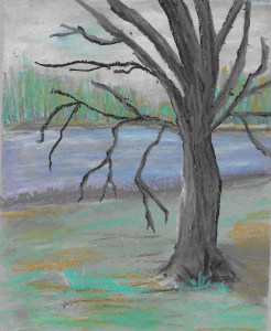
I was disappointed in the tree, but this was essentially a “play” piece, a chance to see what I could do with my oil pastels, and a chance to see if my chosen color scheme worked. I have to say that the palette is, well, different, and I think I like it simply because it is different, but maybe I’m a bit biased since I’m the artist.
Overall, I’m happy with this pastel painting, and I’m eager to try additional landscapes in oil pastel. I want to try different color schemes, try different techniques, use different supports… and just see what I can do all on my own.
This painting was completed entirely with oil pastels from my Gallery set. This is a fairly inexpensive set. A more expensive set, such as Sennelier, would blend a little more easily. For blending, I used my fingers a bit, cotton swabs mostly, and a tortillon.
Next, I think I’ll get out my Paul Rubens oil pastels and do a landscape with them, just to see how different they might be. I do think I’ll probably purchase a “pastel sorting box” very soon, so that I can have all my oil pastels accessible, and one of these days I’ll also give in to the temptation to purchase more Sennelier oil pastels. I have only a small set, and they are like butter!
I definitely include oil pastels now on my list of “favorite media”, and I’m really looking forward to trying more tips and tricks, using various color schemes, and creating many more landscapes.
NOW, BE HONEST, PLEASE.
WHAT ARE YOUR THOUGHTS ON THE COLOR SCHEME I USED FOR THIS OIL PASTEL?
LIKE IT? LOVE IT? HATE IT?

I love the idea of re-learning (or learning for the first time) how to uses art materials. Even the experiments are enjoyable. I like this color scheme — it is softly muted in the blue range, which is one of my favorites. I do love bright colors, but I do tend to be affected more by muted purples and blues. Great work for a first go!
LikeLiked by 1 person
Thanks. I wasn’t sure how well the color scheme worked. I liked it because it was a little different.
LikeLike
I love the orange, and I love the blues. The green is a bit too turquoise for me–or two light in value? And I really like the tree and the grayish horizontal banks.
LikeLike
Thanks. It’s fun to try out different color schemes. I wasn’t sure if this one worked or not.
LikeLike