
Yes, today I’m sharing another pear, the fourth pear I’ve done. One was in charcoal, the other three are graphite drawings. I’m pleased to say that I think I’m getting a little better in both getting the right shape and in my shading and blending.
Let’s take a look at the progress I’ve made.
First, was this graphite drawing. Not a great drawing, but it is recognizable as a pear. I did fairly good in copying the shape from my reference photo — maybe a bit too thin, but overall the shape wasn’t too far off. The shading… well, definitely nothing to brag about. Again, though, it was close to what was shown in the reference photo.

Second was a pear drawn with charcoal. I was pleased with this drawing, although it didn’t really go along with the actual “assignment” — which was to use gray-toned paper, do the charcoal drawing, and add white charcoal for highlights and for a background. I just did it instead as a quick charcoal sketch in my sketchbook. Again, not the greatest, but again, most definitely recognizable as a pear. I was happy with this pear if only because I managed to create a charcoal drawing without too many smudges. The shading is still a bit messy, but better than my usual attempts.

Third was a pear that I had high hopes for! I used very light pencil marks for the original contour, but then in the process of shading and blending, many of my lines got erased and re-drawn, resulting in a very skinny pear — compared to the reference photo. Yes, it’s still rcognizable as a pear, but I was a bit disappointed with it. So disappointed, in fact, that I resolved to do it over, making sure I fattened it up a bit.

Before doing the “re-do”, I took my reference photo and “posterized” it — reducing the image to three fairly distinct values. I felt this would help me more clearly “see” where to shade and blend. And I did take time to make sure my basic contour was close to the reference.
And so, I proudly present to you, PEAR #4 — Another Graphite Study.
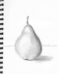
No doubt you’re tired of seeing pears, but hopefully you’ll look at this one and agree that there’s been a bit of improvement.
OK, so maybe not that much. It’s still messy. I’m still not good at blending, even when I know where to place the different values. But I’m working on it. I do need to be more careful about erasing some of my “light starting lines”. I’m always hesitant to make my contour lines too dark and too distinct even after I’ve figured out exactly where they should go. So, I end up with lots of “left-over” pencil marks.
Now, again, in order, here are four pears:
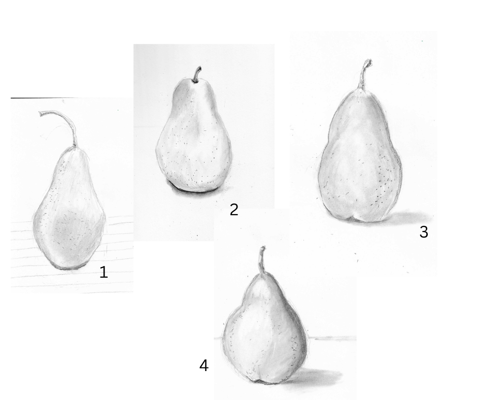
Seeing them together, I think the improvement is clear. That makes me happy. Happy enough to keep drawing pears — not what you wanted to hear, right? I’m sure you’ve had your fill of pears, but, yes, there will be more to come! Soon I’ll be getting out my colored pencils again, and pears will be a great subject to draw! And maybe I’ll even do a pear — or two, or three — with pastels.
Now that I’m getting back into art and “re-learning to draw”, pears have become a favorite subject. Yes, expect to see more pears, and hopefully you’ll also see more and more improvement with each one.
Want to see some of my older pears? Check out these old posts!
Dipping and Stippling Do Not Mix
The Sketchbook Revival Experience
There may be more, but as I’ve said, you’re surely had your fill of pears! Maybe next I’ll work on oranges or bananas!

Lovely! I really like #2 because of the strong contrast with the shadow! These are lovely.
LikeLiked by 1 person
I like #2 and I like #4. I’m really, really working on shadows — and getting “a full range of values” in every drawing. I’ve heard that phrase so many times! I’m trying. I’m really trying 🙂
LikeLiked by 1 person