I’m of two minds when it comes to the concept of challenging ourselves. One school of thought teaches that it’s good for us to push our limits, that we’ll never know how far we can go unless we try. Certainly there’s something to be said for that way of thinking.
Yet another valuable principle suggests doing just the opposite, not pushing ourselves to achieve more, but to give ourselves opportunities to succeed by reducing expectations. Maria Montessori taught this principle in her work on education. Make it possible for even the youngest child to accomplish tasks, not by pushing them, but by making the tasks easy enough for their skill level. The idea is to build confidence, to make the process fun, to instill a “can-do” attitude.
Both methods have their merits, to be sure. With art, I know it’s good to challenge ourselves from time to time, but I also know how discouraged I get when I take on an art project that’s just a bit too far beyond my capabilities. I know, too, how enjoyable “simple” projects are. For me, it’s important to find projects that I can successfully complete, things that make me smile and say, “Yes, I can do that!”
My current project is one that seems to be right at the line between “do-able” and “a bit too much”, and maybe that’s really the best place to be. It’s a graphite drawing using a reference photo of our calico cat, Flower Child. You saw my initial “contour” drawing in my recent post on using grids.
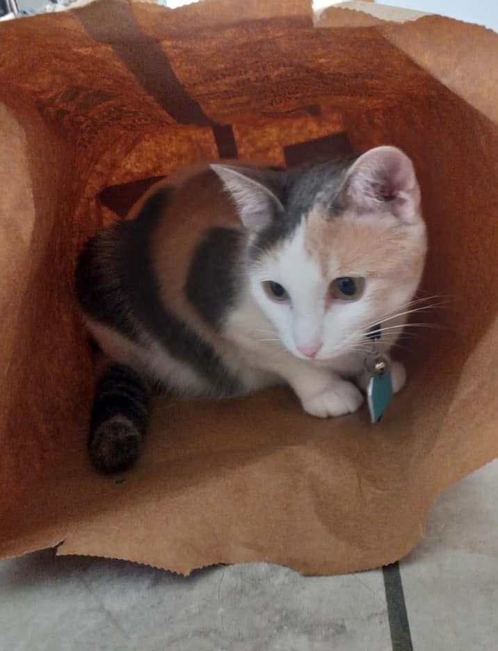
Now you can see the actual reference photo I was working from.

I’ve always loved this picture. Flower Child had climbed into a paper bag — as cats so love to do! I quickly took the photograph, titled it “A Bag of Flower” and shared it with Help Humane, the animal rescue group from which we adopted our girl.
As I was browsing through photo files in search of a good reference for my “Grid Drawing” lesson, I chose this one, focusing primarily on Flower Child and not really paying much attention to the background, or more specifically, to the drawing challenges the background would present.
I started the drawing with a very light contour sketch — using a 4H pencil — and I was pleased with it. Then I began working to establish the different values of her tri-colored coat. One reason I chose her as a subject was because I thought it would be good practice for me to see if I could capture the different values of her fur in graphite.
Once I started working on the drawing, taking my time and really trying to do my best, I had to confront the challenges offered by the background. I made a few feeble attempts and then shook my head. Drawing that paper bag and getting all the values right would be impossible for me.
Why hadn’t I realized this before? The answer is fairly easy, I think. I was seeing the photo in color and not thinking of how different it would look after being converted to grayscale. Without the actual color, it became difficult in many areas to actually distinguish cat from background!
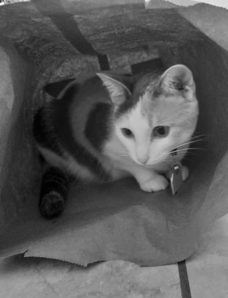
Keep in mind, I’m drawing with limited vision. What I see with my left eye is little more than a blur. Maybe you can clearly see what is animal and what is paper bag, but I struggled with my printed reference photo. I did crop the photo so that Flower Child is the main focus — the focal point of the drawing — and never mind that “rule” that says the focal point shouldn’t be at the center. I also took the liberty of leaving her rabies tag out of the drawing. Why complicate things any more than necessary?
It wasn’t until I started adding in the values that I truly realized how difficult the “paper bag” background was making the drawing process. I went into my Windows/Microsoft photo editor and removed the background. This was very helpful for me in completing the drawing.
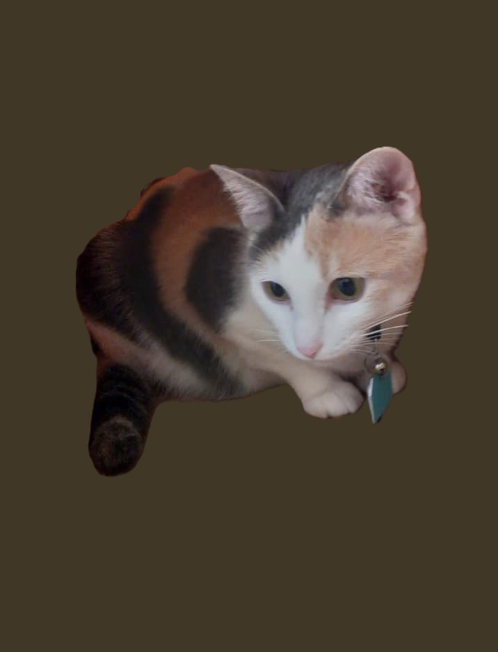
Another problem I encoutered is that removing the background takes the image “out of context”. You can no longer tell that this is a cat crouching down inside a bag, so rather than the drawing being a fairly good example of foreshortening, it looks more like a woefully misproportioned cat with a head too big for her body.
When all is said and done, however, I’m pleased with this drawing. Considering that I’ve done virtually no graphite drawing whatsoever for the last two years — at least — I think this turned out better than I expected. At the very least, it’s definitely recognizable as our Flower Child.

It’s rough, yes. It’s far from what anyone would consider a “finished graphite drawing”, but it’s finished enough for me. I’m encouraged by the drawing. I took on too big of a challenge at the start, without even realizing it, but once I did see the problems, I simplified things to make it possible for me to complete a “successful drawing” — by my standards.
So, where do you weigh in on the concept of challenging ourselves? Do you like to push yourself as far as you can? Sometimes that is a good practice. Or do you believe that achieving a satisfactory result may be a better choice? The answer, of course, depends on who we are, what skills we’re developing, and how we handle both success and failure. For me, at this particular time, lowering my expectations and coming away with a drawing I’m happy with far outweighs any possible benefit of “pushing myself”.
Oh, one other thing. Yes, you can still see the grid lines in the drawing. One of the kitties has made off with my kneaded eraser again. Little Hopie thinks it’s a great play toy. Once I find it, I’ll erase those marks, and then the drawing will truly be complete.

You are much more adept with pencil shading than I am. The best picture of my cat I ever managed started as an experiment in wet on wet. I dropped ultramarine into the wet and it bloomed into something resembling fur! She was a black cat but looked good in blue.
We walk till we’re ready to run. And I enjoy a nice walk…. love your posts.
LikeLiked by 1 person
I could go back and make the dark areas darker… but why? I’m really happy with the way the drawing turned out simply because it really did exceed my expectations, so I’m leaving it just the way it is. Shading has always been difficult for me, so I’ll continue to work on it with future drawings. I doubt that I’ll ever be very good at it, but I will get better 🙂 And speaking of blue…. my mother in law got a cat statue — unpainted — and she asked me to turn it into a calico. I might have pictures somewhere. I used acrylics, and my husband was almost mad because I used a “blue-gray”. He insisted in was just “too blue”, and blah, blah, blah… until it was all said and done and he remarked, “You know, that gray really does look right.” So, I agree. Cats can look very good in blue.
LikeLiked by 1 person
I like it a lot! Great way to work with foreshortening!
LikeLiked by 1 person
Thanks. Yes, I was happy with it. I’m so out of practice with drawing… and this was really fun to do. My animals are usually so awful! The grid really did help me with this.
LikeLiked by 1 person