
A couple days ago I was crying out for help with perspective drawing, and today… well, another day, another cry. Or you could say, a different day, a different drawing problem. With perspective, I can more or less work my way around problems by simply avoiding architectural drawings or anything that requires precision in perspective. Since I mostly paint landscapes, I can — as often as not — get by without exact angles and perfect perspective.
But there’s another drawing problem I’ve wrestled with from the beginning. Shading. As with perspective, I know the basics. I understand the concepts involved. Lighter areas advance. Darker areas recede. Using shading allows us to create the illusion of form. Over the years since I began learning to draw in 2015, I’ve shaded countless squares to make cubes, triangles to create pyramids, and flat circles to illustrate spheres. I’ve played with various grades of pencils ranging from very hard to super soft, and I’ve made lots of gray scales.
I’ve also practiced shading techniques, trying to keep lines close together, remembering to work from my elbow or shoulder and not from my wrist, keeping in mind the various methods of scumbling, hatching, cross-hatching, and all those little circular movements that are intended to produce smoothly shaded areas. I’ve practiced gradients, too, trying to move from the lightest marks to the darkest marks possible with each of my drawing pencils.
But nothing I’ve done in the past prepared me for the problems I encountered with this drawing — a copy of an illustration from Barrington Barber’s 10-Week Course for Aspiring Artists.
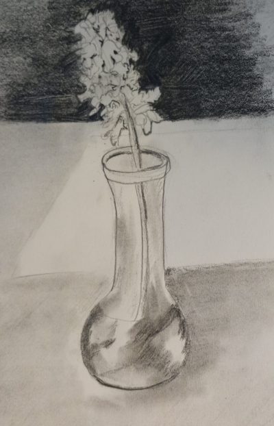
I don’t have to point out the shading problems here. They’re obvious. Before we get to them, however, I do want to point out the actual blooms on this flower. I like what I did here, how I used lots of curved lines and scribbled shapes to truly give an illusion of some sort of flower. I was pleased with that part of the drawing. As for the rest of it, again, the problems are obvious.
 In Barber’s book, his approach is to first make a simple outline drawing. In the next step, his instructions are to “make a light tone over all the areas where the shading will be, leaving untouched white paper for the highlights.” I found this step a bit difficult — and also, for all practical purposes, rather unnecessary. Were I to make a drawing like this — outside of doing this as a practice exercise — I would not use white paper. I would use a gray toned paper, such as that offered by Strathmore. I would then use a white charcoal pencil to add highlights.
To me, this seems to be the most logical way to approach a drawing like this where much of the drawing is a mid-tone. For me, it was difficult to achieve any sort of smooth, softly shaded area around the vase. The only area that even comes close is the shadowed area on the middle-left. For the most part, I’ll admit, I wasn’t trying too hard to achieve perfect results. I was just doing the best I could without worrying over the results. I did try using a blending stump, but the results weren’t very good. Blending stumps in my hands seem to just make my shading messy.
One intention with this drawing was to use shading techniques to give the impression of water in a glass vase. I think maybe — just maybe — if you stood far, far away from this, you might get that impression. Or maybe not. By the time I was shading that part of the drawing, I was already a little frustrated.
The third step, as you might guess, was to “build up more varied depths of tone to give the objects substance.” Barber points out how he placed the flowers against a dark background to show up their brightness. That is, of course, the most eye-catching aspect of the drawing. It’s the point of strongest contrast which would clearly make it the focal point.
 What Barber fails to explain, however, is precisely how to create that dark background using graphite pencils. Here, again, I could find a work-around for this. I could probably use a stick of vine charcoal or a carbon pencil to create a “dark dark”, or I could do this drawing in ink and use a marker to create a much smoother — and blacker — background, similar to what I did in another of Barber’s exercises.
But this was, presumably, a graphite drawing exercise, and Barber, presumably, created his illustration using graphite. So, how?
I tried several different methods.
First, using a 4B pencil and a considerable amount of pressure, I tried simply “coloring in” the background, trying to use the side of the pencil lead. This worked… a bit. But soon it was getting sketchy and scratchy, and despite rotating the pencil several times, I couldn’t apply the shading with any consistency.
Second, I opted for a softer pencil. I tried an 8B, and while I found it a bit easier to cover the area with slightly less pressure, I still wasn’t able to create a dark background similar to Barber’s.
Third, I tried going over areas multiple time, thinking that I could darken the shading with additional applications. This might have been a good approach, had I tried it from the beginning. At that point, however, I already had such a mess, nothing was really going to improve it much.
I did consider grabbing a Sharpie and going over the background, but I decided against it. This was a graphite drawing practice, so using ink for the background didn’t feel quite right.
So, now, can someone please tell me how to create a dark background using graphite? I suppose the logical answer is to (a) use a soft grade pencil, and (b) keep practicing. Or, another possibility I discovered is to use powdered graphite. It’s messy, though, and it might not be suitable for shading in partial areas, as in Barber’s illustration.
I did find a few tips here: How To Achieve Dark Tones in Graphite Drawing
Of course, it’s important, too, to keep in mind the nature of graphite. Different media are suited for different uses, and graphite pencils really aren’t intended for creating black backgrounds. Graphite becomes shiny. It’s easy to overwork graphite. Different paper textures will be a factor, too. So for now, I’m chalking this drawing exercise up to a good learning experience. I know a lot more now about how not to use graphite, and I had the pleasure of creating a “flower illusion” that I liked, so even though the drawing is not a successful re-creation of the illustration that inspired it, it was still excellent practice.
Now, time to go play a little more!

Couldn’t resist, got the kindle version of this course for .99 with a credit I had on my amazon account,
Found this:
https://drawingacademy.com/how-to-achieve-dark-tones-in-graphite-drawing
I would swatch it first with the paper I intend to use. One trick I learned from my colored pencil tutorials is multiple light layers are the way to go. Would that help with graphite?
LikeLike
Yes, that was one of the sites I visited. A lot of helpful info there. Multiple light layers can help, but with graphite it’s really not possible to get extremely dark backgrounds without getting a lot of “shine”. For smaller drawings, I’ll add carbon pencil or charcoal pencil to darken areas, but that’s not practical for large areas. Let me know what you think of Barber’s 10-Week Course. I found it helpful as a “remedial” crash course because he covers so many different drawing subjects. But had this been the first “how to draw” book I’d ever read, I would have given up by the end of the first week. I’d love to hear your thoughts on the course.
LikeLike
I think you have stumbled on the reason I no longer draw with graphite. Its too much work! You might have better luck with different charcoals for getting that deep dark down quicker and easier. Try different charcoals to find what works best. Vine charcoal. Willow charcoal. Compressed charcoal. I am no charcoal expert but I would experiment. I see no reason to stick with graphite except its less mess. But about shading, you are really talking about ‘values’. Try just painting with mixing white and black to achieve different values. Once you understand values, it will help with working in color.
LikeLiked by 1 person
Yes, it’s all about values. So I’ll keep practicing and keep learning as much as I can. Hopefully my shading techniques will improve over time.
LikeLike
And, forgot to add, you may have the idea of dark vs light a little off. Its not receding if darker. Just the opposite. In atmospheric perspective, the further away something is, the lighter it is compared to if it was closer. Is why the mountains, say in a landscape, are lighter than the foreground. If you read somewhere that darker is receding, not so. Look at some landscapes, either photographs or from good paintings and check it out.
LikeLiked by 2 people
You’re right, of course, about atmospheric perspective. The colors in the distance are much lighter and the details are softer. There’s a lot to think about when it comes to values!
LikeLike
Yep, its not simple at all. Light vs shadow, atmospheric perspective, etc., cool vs warm colors, etc. Working with just black and white, your mostly concerned about light vs shadow which has not much to do with coming forward and receding unless you are doing a landscape. With Still life, the atmospheric perspective plays not much of a part. The light and dark has to do with the properties of light on the subject, mostly. The places where there is no light are darkest. Places where the light is the most intense are the lightest. The local color of an object does change the value, i.e. a lemon would generally be lighter overall than a dark red apple. But with intense light, they will both have the same lightest lights and darkest darks in value. You might want to find videos by the artist David Leffel who has some simple demonstrations on this for Still Life, explaining light.
LikeLiked by 1 person
Thanks. I’ll check out the videos.
LikeLike
I don’t know about anyone else but “shiny” graphite has never been anything I was particularly upset about. As long as it’s dark enough let it shine on. I did always get my darks by starting with a harder pencil and working my way through to softer ones. I also made sure to fill in an area using a variety of angles to the strokes, a minimum of top to bottom, side to side, and two crossways angles. All that stuff might or might not address your issue. 🙂
LikeLiked by 1 person
I think those are good tips. Mostly I just need to practice keeping my pencil strokes close and consistent. Thanks for the suggestions.
LikeLike
Just keep practicing. You are doing well. I always find I have to draw the same subject about three times before I start to feel happy with it and that’s before I add any shading… I wonder if it takes this time for the artistic side of my brain to start working … Sometimes I have to take a lot longer to get into drawing certain subjects … I do find Roses are a particular challenge, along with people’s faces, and animals… I had to draw animals again and again to get ready for a dyptich painting I painted last year because I was unfamiliar with some of the animals… So I would say to just keep practicing. I used to really like the book “Drawing on the Right Side of the Brain”… I think that’s what it was called… Hope it all goes well. All the best, Jen X
LikeLiked by 1 person
Thanks. Repetition is very helpful. When I first started learning to draw a few years ago, I copied the same simple illustrations over and over again — usually 10-12 times — until I finally got “a feel” for what I needed to do. That’s still a good approach, I think. Over the summer, I took an opposite approach and just drew very quickly. It helped me relax and have fun. It’s easy for me to take myself too seriously with things, so I needed to make art something I could just play with over the summer.
LikeLiked by 1 person
Yes definitely agree! I have serious Art projects and also my sketchbook for fun, quick sketches
LikeLiked by 1 person
All through the summer I’ve repeated this mantra: I’m not being graded on my art! It’s really been fun to “scribble” and make bad drawings. I’ve realized that even in the worst of my drawings, I can still see potential there, so it’s all good. 🙂
LikeLike
Thanks for sharing. 🙂
LikeLike