After finishing my triumphant “masterpiece” last week, I was definitely excited about oil painting. I had landscape visions dancing through my head and couldn’t wait to get back to my easel.
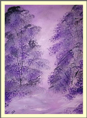
I wanted to do a soft, pastel scene, something delicate and imaginative. I wanted the painting to be light and airy, with an almost mystical feeling about it.
My colors aren’t quite what I’d envisioned, and the photograph makes the colors much different from what they actually are. My original vision was more pink than purple, and in the actual painting the foreground is much lighter and whiter. I wish you could see the original.

I did find a lovely use for the painting, or actually, for the photograph of it. I’m using it as the wallpaper on my phone, and it looks nice. It makes me smile every time I pick up my phone and see the soft, lavender background.
“I made that. That’s my painting,” I say to myself. Art should make us happy, and this painting does that for me. I used colors I love, painted a scene from my heart, and I’m delighted to share it here. The trees on the right didn’t come out quite right, mostly because I kept “tweaking” them. Will I ever learn?
If you look closely in the bottom left corner, you’ll see I did add my initials. For now, that’s my way of signing my paintings. I’m still working on a signature I like.
Now, so many more scenes are in my head and in my heart. I look forward to painting each day and trying different things. It’s nice to be a beginner. That gives me so much more to learn, so much more to dream about.
Thanks for sharing my dreams!

Happy learning Judith!
LikeLiked by 1 person
Thank you! I am enjoying it immensely.
LikeLiked by 1 person
Beautiful! And I love the joy it is bringing you!!
LikeLiked by 1 person
Thanks, Jodi. Again, I wish you could see the original. The colors are much softer and subtler, but the photo works great for me on my phone. 🙂 It really is fun to look at it and know that it’s something I created.
LikeLiked by 1 person
I get so mad when a photo or scan completely changes what I see in person! I get it! It is still very beautiful Judith!
LikeLiked by 1 person
Thanks 🙂
LikeLike
love the purple
LikeLiked by 1 person
It’s actually a very light pink in the painting, but the photograph is lavender. It works well on my phone 🙂
LikeLike
Lovely painting, Judith.
Leslie
LikeLiked by 1 person
Thank you, Leslie. 🙂
LikeLiked by 1 person
Thanks for sharing. Enjoyed your posts.
LikeLiked by 1 person
Thank you so much for visiting my blog. Please feel free to offer any advice and suggestions. 🙂
LikeLike
Great to see you are getting joy from your painting! The painting has nice subtle edges – reminds me of some of the mystical Japanese paintings.
LikeLiked by 1 person
I’m so happy you said that! The “Japanese” painting effect was exactly what I had in mind. The actual colors are more pink and grey with white, so the painting has more of the effect when you see it as opposed to the photograph. But the picture sure works as my phone wallpaper 🙂 Yes, I’m loving my oil paints.I’m learning new things every day.
LikeLiked by 1 person
Hi Judith. I am trying to walk the same road that you seem to follow, after 35 years of not drawing or painting anything. I am just beginning to take art classes again, mainly drawing and a little bit of acrylic painting. And I love it. May colours enlighten our lives and get our souls back to vibrating again.
LikeLiked by 1 person
Thanks so much for visiting my blog and sharing your experience. Sorry for the late reply but illness has kept me sidelined for many weeks. I’m just now getting back to my easel, and I hope to create some paintings to show off 🙂 I hope you’ll visit again.
LikeLiked by 1 person