Many, many years ago, Rodgers and Hart wrote the score for Words and Music, a movie experience that told the story of their collaboration and ultimate success. The film was filled with spectacular musical numbers, including Judy Garland singing about the plight of poor “Johnny One Note.” Being a young musician, I loved Words and Music. As a child, I was already a fan of Judy Garland, but all the same, I didn’t care for “Johnny One Note”. He was, you see — according to the song lyrics — a fellow who could sing only one note.
Of course, he sang it with gusto, drowning out the bass and the drums, the flutes, and even the trombones. He sang his note until he was blue in the face.
I suppose there’s a message in the music there. Find one thing you do well, and do it. Do it loudly. Do it unapologetically. Do it every opportunity you get.
Now, that is good advice, especially for new artists like me. I’m learning to be loud and unapologetic! I’m seizing every opportunity I have to draw and paint. Unfortunately, unlike Johnny, I haven’t yet hit upon my “one note” — that one single thing I’m good at.
Actually, though, I’m digressing, straying far from the point of this post. It’s not about music or messages. It’s really about monochromatic color schemes, which sound about as interesting as a one-note song.
In looking back through art history, you’ll see that there have, indeed, been artists who have taken monochrome to extremes, such as Yves Klein, whose 1957 exhibition ‘Proposte Monochrome, Epoca Blu’ featured 11 identical canvases, all painted with ultramarine blue. Klein might have been an artist with a following, but may I refer back to a question I posed recently and say, yes, but is it art?
Generally, when we talk about monochromatic art, we’re meaning art that is based on a single hue, with many variations of shades and tints. Using a monochromatic color scheme can help an artist create a mood, as well as focus on tonal values in the piece. Blue monochrome paintings might suggest peace and tranquility, while a red monochrome would be more suitable for an energetic work or one that focused on a dangerous situation.
Colors each have their own meanings and associations, and learning to use colors properly is one of the most important elements in the study of art. I’ve learned a few basics, and I want to further my knowledge of color theory.
What better way to begin than by studying individual colors and creating paintings from them?
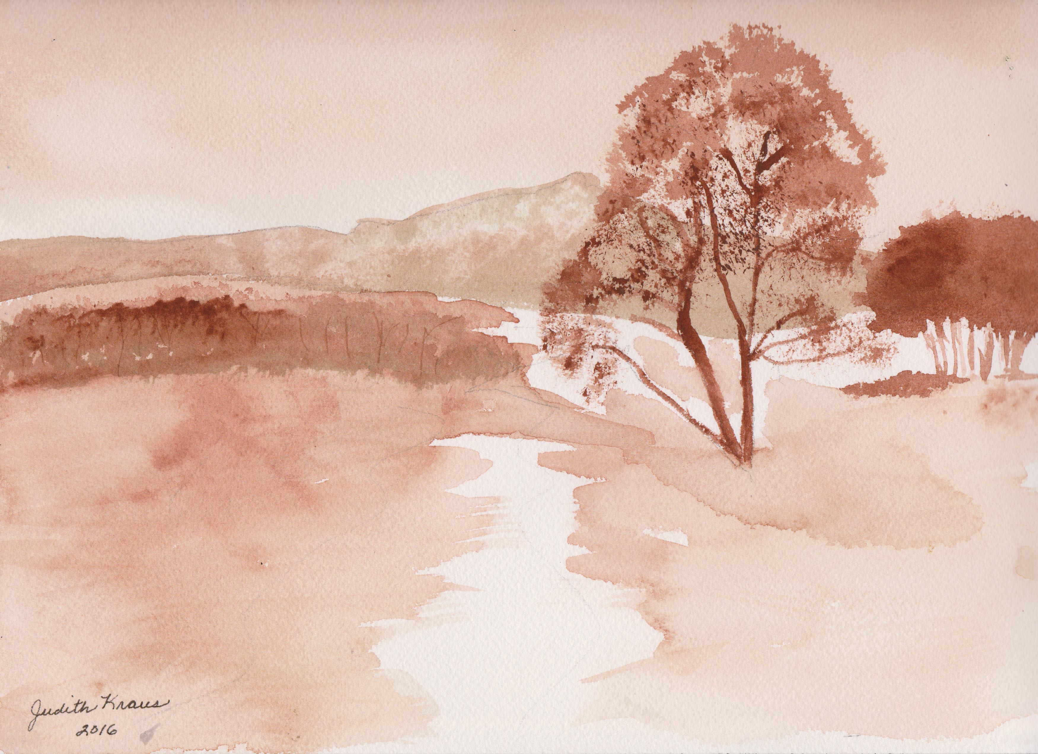
For my first monochromatic watercolor, I chose burnt sienna. I wanted an earthy feeling to the scene. I wanted, too, to create a piece with a bit of warmth.

Immediately I wondered how the same landscape might look in a cool hue, so it was back to the easel, this time to grab a tube of blue watercolor — but how about using a “warm” blue like Ultramarine?

You’ll notice it’s not an exact reproduction of the first painting. It’s similar but different in some respects. I definitely prefer the “earthier” Burnt Sienna to the Ultramarine.
And what if I used a cool blue?

Again, it’s not an exact reproduction, but similar in style to the previous two monochrome landscapes.
Finally, after listening to “Johnny One Note” over and over, I had to do one more landscape and bring in a few different colors. I haven’t decided which one is my favorite, but it was a fun way to spend an evening.

Which one is your favorite?

I like the burnt sienna. (K)
LikeLiked by 1 person
Thanks. I think it’s my favorite, too. 🙂
LikeLiked by 1 person
I think my favorite is the one in full color. I saw the Burt sienna and really liked it….nice trees by the way. Then I saw the blues and liked both of those two….but then the color came and I’m a sucker for full on color. So hard to choose!
LikeLiked by 1 person
Thanks, Dawn. I like the color one, and of the three monochrome paintings, I think I like the burnt sienna best.
LikeLiked by 1 person
It’s hard or me to choose between the monochrome a cuz I like them all and they are all just a little bit different. So hard.
LikeLiked by 1 person
I also made a “trading card” landscape like the burnt sienna one and submitted it for Grumbacher’s current Artist Trading Card event. The theme is “Water”…so I did a landscape with water in the scene, using watercolors. I thought that would fit the theme nicely. 🙂
LikeLiked by 1 person
This sounds stupid…but what is an artist trading card?
LikeLiked by 1 person
It’s a small piece of art (the size of a baseball card) that artists trade. Artists can do it individually or in groups. Grumbacher Art Supply features one every month or so. Artists create their ATC, send it in, and Grumbacher posts them all on their Facebook Event page, then “swaps” them…they’ll send mine to another artist, and I’ll get someone else’s card. Plus with Grumbacher, when you participate in ATC events, you get a “punch card” and earn free art supplies. 🙂 Here’s the link to the Facebook event. Everything is explained there. https://www.facebook.com/events/974199546028381/
LikeLiked by 1 person
Nice. Okay. Thank you very much for the link. Free art supplies sounds excellent.
LikeLiked by 1 person
Yeah, I’ll always take free art supplies. Grumbacher also has a “Mystery box” giveaway every Monday on their Facebook page. I actually won a mystery box a few months ago. I got opaque watercolors, acrylic markers, some brushes, pastel pencils. Lots of goodies.
LikeLiked by 1 person
Ooooooh. That sounds nice.
LikeLiked by 1 person
If you need the Facebook link to their official page, let me know. That’s where they do the mystery box giveaways.
LikeLiked by 1 person
I saved the other link so I can look around. I will find it, but thank you for the offer.
LikeLiked by 1 person
I love the second one. I have always loved blue tones…and to me this reminds me of that “bone chna” blue, or of Japanese art…like a Hokusai, reminiscent of Fine Wind, Clear Morning. I love blue :-))
LikeLiked by 1 person
Thanks. Blue is my favorite color, too. For the landscape, though, I’m learning more toward the burnt sienna just because it’s “earthier”. I do love that blue China with those lovely scenes.
LikeLike
Burnt sienna gets my vote.
LikeLiked by 1 person
Thanks for voting 🙂 I’ve decided the burnt sienna is my favorite, too.
LikeLike
There are parts of each that I like more. I like the distant trees (both sides of the path) most in the third one, the mountains more in the second, the main tree more in the first. However, I have always considered (and was taught) that ultramarine is a cool blue, whereas cobalt is the warm blue. I was taught with a very limited palette. The only other blues I’ve used are pthalo – both blue and green shades, and I recently was given an cerulean in oil, though it’s not something I would necessarily purchase. If ultra is your warm blue, what is your cool blue? And where on your scale does cobalt come?
LikeLiked by 1 person
Interesting. I’m still learning my color theory, so I could be confused, but I had ultramarine down as warm and cobalt as cool. I’ve found that it’s sometimes difficult to get precise information on different pigments. My aim is to build a palette with 3 cool primaries and 3 warm primaries, plus a few earthy neutrals. I’m open to suggestions!
LikeLike
I use (and teach) this: cools: ultramarine,lemon yellow,alizarin crimson; warms: cobalt, cadmium yellow medium, cadmium red medium. Extras: Ochre, burnt umber. Book recommendation: Blue and yellow don’t make green by Michael Wilcox, isbn 0 9587891 9 3. Hope that helps!
LikeLiked by 1 person
Yes, thanks a lot!
LikeLiked by 1 person
I am a lover of color so of course it would be your last rendition. But I do like the detail work of you burnt sienna version. Can I like them all? I think one should.
LikeLiked by 1 person
Thanks. I’m delighted that you like them 🙂
LikeLiked by 1 person
Great experiment Judith – I love the burnt sienna one – so much depth and warmth and earthiness to it. I love how different they could look with mono colors and full colors! Thanks so much for sharing!
LikeLiked by 1 person
Thanks. It was really fun to try different colors. I couldn’t see doing a landscape in red though. I thought about doing green, but green skies didn’t appeal to me. That was when I decided to do the fully-colored one. Next, I’ll be getting bi-polar LOL…doing complementary color schemes. That will be fun, too.
LikeLiked by 1 person
I’m going in the burnt sienna camp… though they’re all lovely! I love the way that one has more contrast and a graphic look to it. It’s really striking!
LikeLiked by 1 person
Thank you, Charlie. Your kind words mean a lot to this watercolor newbie. 🙂
LikeLiked by 1 person
You’re so welcome, Judith! I’m just a newbie too! I’m just coming up on my first year in July! 😊
LikeLiked by 1 person
You’re light years ahead of me. I did my first watercolor in February, and I know I won’t be anywhere near your level of accomplishment by the end of the year. I love your doodlewashes!
LikeLiked by 1 person
Awww thanks!! And what? You’re already awesome! If you do it daily, cool things happen… that’s all I did (though I still have those days where I think… Oh my gosh… that stinks… I forgot how to paint! Lol I think we should always have a beginner mindset! hehe… it’s a journey!)
LikeLiked by 1 person
Quite a fun journey. 🙂
LikeLiked by 1 person
This is a pretty cool excersise Judith, I loved reading your post and its kinda hard to choose but I’d go with the burnt sienna as well. It turned out really well!
LikeLiked by 1 person
I’d go for the last one, but if we’re talking mono, then I’d pick the burnt sienna. The second one in blue works, too. Do I win something if I pick them all? This is so hard.
LikeLiked by 1 person
You win my everlasting gratitude 🙂
LikeLiked by 1 person
Mine would definitely be the last one. I love color and that last painting had it all. Though the burnt sienna is calling…..hmm both of them. 🙂
LikeLiked by 1 person
Those are my picks, too. 🙂
LikeLiked by 1 person