
I’m getting more and more “settled in” to my art studio, and “settled in” to what I enjoy doing as an artist. Having explored many different media over the years, and having tried many different genres, I know where I’m happiest.
I love landscape art, and I also enjoy doing a bit of still life art, too. I love practicing my graphite drawing skills, and I love working with oils, as well — both oil paints and oil pastels.
Lately, as you know, I’ve been working on a “100-Day Project”, focusing on drawing three-dimensional forms, excellent practice for both still life and landscape work. Most of my 100-Day Drawings have been in graphite, but recently as part of an oil pastel course I’ve been reviewing, the lesson was on creating these three-dimensional forms.
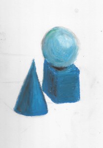
I was happy with my forms. I had fun with my oil pastels, and I felt that I had successfully created the illusion of height, width, and depth. So far, so good!
Then, in the final lesson, the assignment was to add a background, along with placing shadows. Oh, dear. I didn’t do so good with this part of the project.
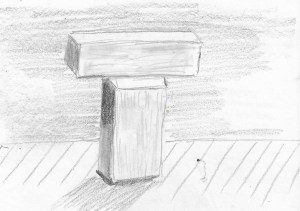
Lately I have been working on adding backgrounds to my “forms” such as the one here — in graphite. It’s just a quick sketch with a quickly-added background, but it does help to “ground” the image.
Well, my attempts at adding the background for my oil pastel forms was a bit sad, but that’s part of the learning process! I think I had problems because I liked the image so well, and yes, I worried that I would, indeed, “mess it up” by adding the background. It’s no surprise that that’s exactly what happened. And the shadow? Egads. I tried. I really tried, but I just can’t yet create realistic shadows.

You can tell that I really didn’t give this my best effort, mostly, I think, because I knew I’d be disappointed in the result. You can tell, too, that I was really unsure about what colors to use for this background. The project was intended to be mono-chromatic, but I just couldn’t decide exactly what blues to use and where to use them, and all in all, I really spoiled what had been a fairly good drawing.
So, time for a background check here!
- Backgrounds are nice. They do “ground” an image, but if I like a drawing, maybe it’s better to leave well enough alone!
- If I am going to create a background — especially with oil pastels — I need to take my time and properly blend the colors I use. I just rushed through this in a half-hearted way, so it’s no wonder I got such splotchy results.
- When I do a background, it would help to plan my colors carefully.
- Creating backgrounds — in any medium — can be a challenge, so this is something I need to practice more.
As for those shadows? Nope. Not going to worry about them yet. They could certainly be better, but they could be worse.
What tips or tricks do you have for creating backgrounds in your still life drawings or paintings?

That colored one with the background looks really good to me! I’m loving the three-dimensionality you’re getting with the oil pastels!
LikeLiked by 1 person
Thank you. I was so pleased with it BEFORE adding the background (and so worried about messing it up) that I just didn’t like the final result. But I really am enjoying oil pastels again, and learning alot about blending and shading with them. I was quite proud of the 3-dimensional quality I got with these forms.
LikeLiked by 1 person