Critiques are helpful; criticism, not so much. We sometimes confuse the two. The difference, of course, is that a critique is an evaluation; it’s an assessment of a work. A good critique should include acknowledgement of the positive elements in our art, yet it should also point out weaknesses that we need to address.
Most art instructors — and even “art-bots” — focus as much as possible on the good. We all love to hear what we’re doing right. It encourages us, I think, far more than any criticism — no matter how well-meaning — can ever do.
A good instructor, however, understands the need for “constructive criticism” as part of any evaluation process. Note the term: constructive criticism. This is criticism which not only points to a problem area but which also offers advice or suggestions on how the problem can be corrected.
CRITIQUING MY OWN ART
When I first began learning to draw, I didn’t need any “official critiques” of my work. I could see for myself what problems existed. Many of my earliest mistakes were ones that are common to new art students. stemming mostly from (a) lack of practice, or (b) lack of knowledge. Over the years I’ve improved in many areas.
Yet one weakness has plagued me from the very beginning. Our drawings — and our paintings, too — should always have a full range of values. To be honest, I find this statement itself a bit problematic. So many times I look at reference photos and frankly, I don’t see a full range of values.
Let’s first be clear on precisely what this means. Having a full range of values in a drawing or painting means having light areas, dark areas, and in-between areas. It means skillfully using the principles of light and shadow — tints and shades — to make objects appear three-dimensional.
But how many values do we find in a full range of values? Three, four, five, seven, ten, twelve? In a previous post, written four years ago, I addressed this exact question: How Many Values Do We Really Need? I didn’t have all the answers then, and I certainly don’t have them now.
To add to the confusion, there are also some art instructors who say that having too many values can create a sense of chaos or confusion for the viewer. Essentially, you see, we learn that the area of greatest contrast is where a viewer’s eye will go. In more familiar terms, this is what we refer to as a focal point. Try it out for yourself. Browse through images online — black and white, or color — and you’ll see how contrast catches your eye. It’s important, but we’re getting away from the real question here.
In order to have a full range of values, do we need to create an almost “paint by number” approach to include as many possible tints and shades as we can? Take a look, for example, at this black-and-white photograph of an apple, an image from a lesson at The Virtual Instructor. Note how carefully the different value areas are marked:

Now, for what it’s worth, the “greatest area of contrast” would be the proximity of that darkest shadow (#8) almost next to the lightest area (#1) close to the center of the image. This is the focal point, theoretically, at least. That little highlight (unmarked on the photo) also provides good contrast, and that’s an eye-catching area, as well.
So, here we have a reference photo with 8 clearly-defined areas of value. Definitely we can say that this image contains a full range of values. Is eight enough? For me, it’s more than enough, but what do I know?
Over the years when my artwork has been “judged” in shows and/or critiqued in workshops or art groups, the most consistent weakness has been that my drawings and paintings lack a full range of values.
- I’ve been advised to make my darks darker and my lights lighter, and for goodness sakes, I do try.
- I’ve been told that my drawings need stronger contrasts.
- I’ve been criticized for having value transitions that are too abrupt.
- I’ve also been criticized for over-blending value transitions.
- I’ve been instructed to look more closely at color values — it’s not always easy to see them!
I can agree with all the criticisms I’ve received about values. I know how important this element of art is. Most art instructors, in fact, consider value to be the single most important element. So, while I do get frustrated at hearing that I need to create a full range of values in my art, I understand the reasoning behind it.
HOW MANY VALUES DO WE REALLY NEED?
This is a key question. Common sense — and quite a few art instructors — will tell us that we need at least three distinct values. This principle is very helpful when choosing reference photos, or considering a “plein air” scene. We should be sure that we have a dark, very dark value. We should ensure that there are also very light areas, and the rest can be a sort of “middle ground”. For me, this is the most logical approach.
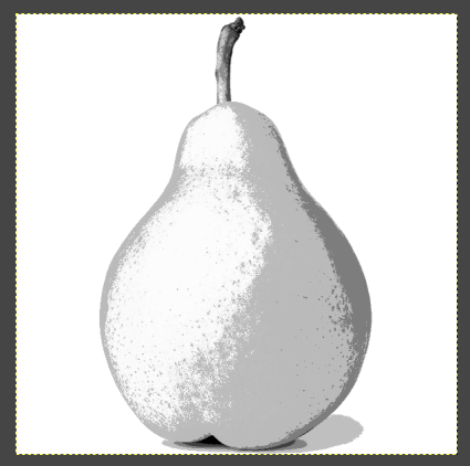
One way of identifying values in a reference is by “posterizing” the image using a photo-editing program. I did this, you might recall, with one of my recent pear studies. To keep it simple, I used only 3 distinct values.
This method definitely helped me see the different areas of value more clearly.
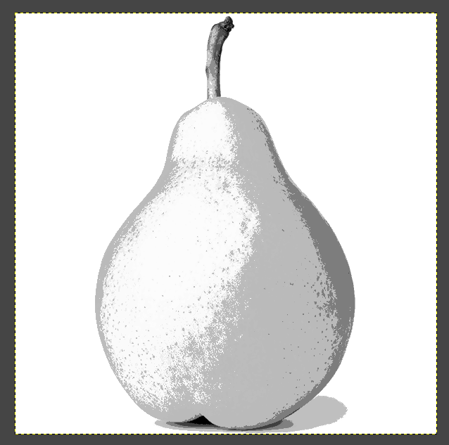
Now, for the sake of comparison, let’s go back to GIMP and see how this same pear might look using different parameters for posterization.
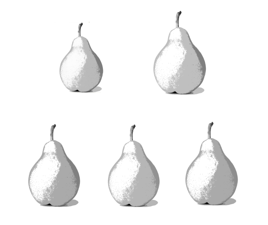
At the top left — the slightly smaller pear — is my “3-value” posterization. On the upper right is the same image posterized to 5 values. The bottom row, from left to right, shows 7 values, 8 values, and 10 values.
There is some difference, yes, but honestly, I don’t see a huge difference. Do you? I’m having vision problems and that makes things difficult at times, but is there really a significant difference between the range of values from the first pear to the last?
WHAT DOES ANY OF THIS MEAN?
Now that I’m getting back into art, I’m really enjoying graphite drawing again, and I want to improve my skills. I know that creating greater contrast by having a full range of values is essential for realistic graphite drawing. For me, right now, this means focusing on light, dark, and in-between. I’m going to simplify this important principle into an easy-to-see format for myself.
I’m going to be sure my drawings have a light value — close to white. I’m going to make certain I have a dark value — as close to black as I can get. And, of course, there will be in-between grays, no doubt a variety of them, but I’m not going to quibble about the exact degree of value.
Light. Dark. In-between.
That’s good enough for me. Hopefully by turning my attention to those extremes in contrast — the light and the dark — I’ll finally achieve the goal of having A FULL RANGE OF VALUES! Hopefully, too, my drawings will include eye-catching contrasts.
I know this is an area where improvement is needed, so I will work diligently on it. And if you have any comments, tips, or suggestions, or if you’d like to offer any constructive criticism of my drawings, please feel free to do so!

I could not agree more I struggle with not getting enough values in my watercolor attempts as I am not copying from real life or from photos 99.9% of the time, I am just letting pigment flow on my paper.
LikeLiked by 1 person
Oh, I hear you! Watercolor is such a trick medium anyway. I have problems enough with graphite. 😦 Value is important; we need lights and darks, but it’s so much easier said than done!
LikeLiked by 1 person
It sure is.
LikeLiked by 1 person
You are right. However, sometimes, it is also the perception. Some people think nothing about being corrected and some take it badly.
I believe that we all can see what’s not right with our drawing or painting. It’s not always helpful somebody pointing out what should be improved. However, I’ve seen in Facebook art groups how absolutely poor paintings get a lot of likes. People mean well, but does that encourage improvement and change for the better?
When drawing, I think it’s best just to use real things and draw as you see them. Who is to tell what the values should be? Sometimes light and direction of light are not that well visible, sometimes the view is not good. There are always good views and bad views of the same thing.
You are doing a lot of exercises. It must be helpful. I make my students draw fairly complex compositions, that masks any minor mistakes and moves forward fast. Everyone is drawing small nowadays which makes me wonder. Drawing and painting big helps tremendously because there’s only that much one can do on tiny paper or canvas.
Good luck with your explorations!
LikeLiked by 1 person
Thanks. I’m really having a good time with my “Shapes and Form” exercises because it’s giving me a lot of practice on areas where I am weak. You’re so right about LIGHT! Sometimes I take my little blocks upstairs for drawing just so I can arrange the lighting a little better. And I definitely appreciate your encouragement!
LikeLike