
I did a lot of different things in the studio yesterday. I worked on shapes and forms — and those perplexing shadows! I dug out my soft pastels for an upcoming project. I made a value scale of my own — how many times have I repeated that exercise? — and for what it’s worth, I spent a little time cleaning and re-organizing.
Most of those things, you’ll note, are more “art-related” than actual art. Drawing exercises, value scales, studio organization… good things, of course. But not things that are actual “art”.
In other words, I was itching to draw something — something besides wooden blocks — but what? Please, don’t mention pears. Like you, I’ve had enough pears. It will probably be a long, long time before I want to look at another pear.
Then I recalled a list of sketchbook drawing ideas that I’ve visited online before. In fact, I’m sure I’ve shared the list before. 101 Drawing Ideas for Your Sketchbook
This is not the only list of drawing ideas you’ll find online, but it’s the one that came first to my mind. If you follow the link, you’ll see it’s from Matt Fussell, The Virtual Instructor, who is my “go-to” art source whenever I’m looking for information, inspiration, or ideas.
Scrolling down a bit, I came to “Easy Drawing Ideas”. Yes, please! I’m not an absolute beginner, of course, having started this “learning to draw” adventure 9 years ago, but I’ve been away from drawing for a while. Yes, yes. I need easy little drawing ideas. I scrolled on down and came to this:
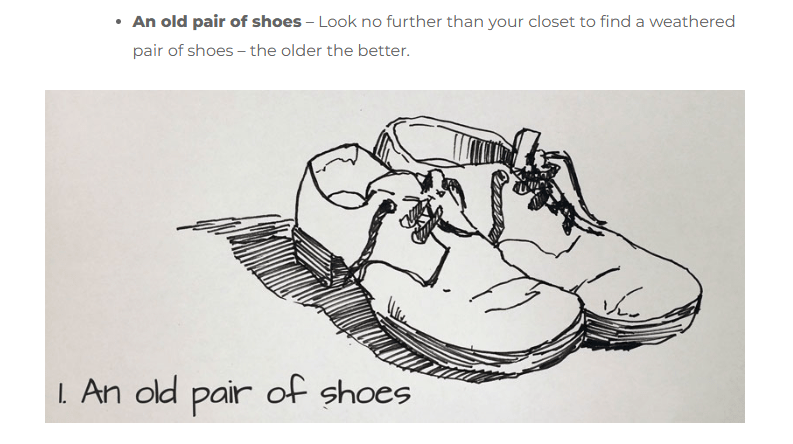
Easy? Are you out of your mind, Matt Fussell? There’s nothing EASY about drawing shoes, old or new. You’ve got to be kidding, right?
Now, I do remember drawing old shoes before. In fact, as a beginning artist back in 2015, I shamelessly traced and shaded Matt’s drawing and called it “good practice”.
There’s something to be said — I guess — for tracing, especially when we’re just beginning to draw. I know I felt a bit of satisfaction when I completed this little “copy” of Matt’s drawing.
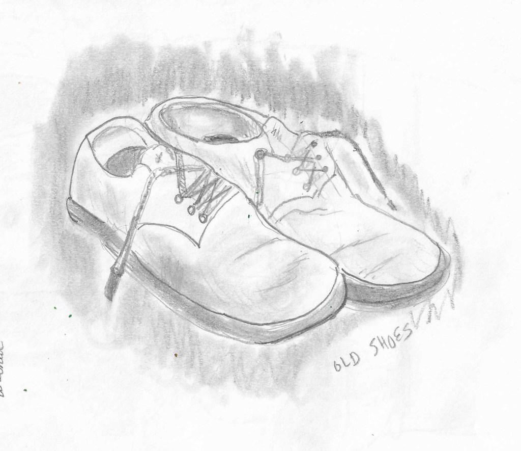
Yesterday, I approached the drawing differently. I wasn’t in the mood for digging out any old shoes of my own, and having had a few frustrations earlier in the morning, I just wasn’t too interested in dealing with the complexities of the “tennis shoes” I was wearing, so I browsed around for a reference photo.
And, folks, I made a good try at drawing a pair of old shoes. And then I looked at it, considered the proportions, and made another good attempt at re-drawing a pair of old shoes. I finally had two shoes that looked relatively close to my reference image, so I settled in to begin refining the drawing, adding value, shading it, blending my graphite. You know, all those things we’re supposed to do in order to come up with a finished drawing.
It grew late, so I set it aside — with only one shoe partially complete — and this morning when I came into the studio I reached for the sketchbook and picked up where I’d left off last night. With fresh eyes, I compared my drawing to the photo. I tried to see the darks and lights. And I tried to draw what I saw.
After a while, I decided that completing one shoe was the best I could do, so I erased all the contour lines of the second shoe, did my best to focus on this one, singular piece of old footwear, and finally I figured I’d done the best I could do. Further fussing and fiddling around with it wasn’t going to improve it significantly.

It is a shoe. There’s a hole in the toe. And I’ve tried to show the lights and darks, and then there’s that very messy attempt at adding shadow. I’m not good with shadows, as you can see.
Overall, the shape of the shoe isn’t bad, and I had “the right idea” with much of my shading, but here’s where I have problems — that idea of getting a full range of values. I tried here. I have very light, highlight areas. I have very dark areas, such as the hole in the toe. And since most of the shoe was dark, I added a lot of darker shaded areas using a 2B pencil. But when I go dark, I get messier and messier. Even considering the “cross-contours” and letting that information guide me, my pencil strokes are still rough and splotchy. My blending just takes my messy graphite and spreads it around to make it even messier.
So, art instructors out there reading this — consider it a plea for help! How do I put down darker shades in graphite without creating messy-looking drawings? Do I need to work more on creating crisper, sharper contour lines? Do I simply need to keep practicing shading techniques? Are there tips I can use to improve my blending?
From the start of this little drawing project, I had my doubts about it. I don’t think “an old pair of shoes” really is an example of an “easy drawing idea”. Yet, at the same time, I felt it was good for me to jump in and do the drawing, despite my doubts. Doing this helped me muster up a bit of determination, showed me again where my greatest weaknesses are, and also proved that even when I do doubt myself I can still come up with a drawing that’s recognizable for what it’s supposed to be.
Now, how do I make my darks darker? How do I keep my lights light? And how do I avoid that “messy look” that has plagued me throughout my drawing adventures? As always, I’m open to ideas and suggestions, so please feel free to share any advice you have.
FYI: Today’s “featured image” was NOT the reference photo I used. It was generated by the Word Press AI-bot based upon the text in the post.

thanks for the link to 101 drawing ideas
LikeLiked by 2 people
My pleasure! Enjoy.
LikeLike