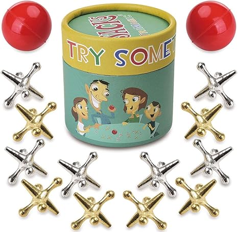
I loved playing “Jacks” as a child, and I actually was fairly good at it, if I do say so myself! The game of Jacks is not as popular now as it once was, but you can still buy these shiny little objects. Back in the day when I was growing up, our jacks came in all different colors. And woe to anyone who stepped on one of them! Ouch. Needless to say, we were always admonished to be sure we’d picked up all the jacks and put them safely away when we were finished playing.
Of course, a “jack” is also a tool for lifting. There are tire jacks, house jacks, and this is the apparent origin of the phrase “jacked up” — which can mean anything from lifted, excited, enthusiastic, or at times, simply messed up.
Many of my drawings do indeed look “jacked up”, and today’s drawing/sketching/shading practice is no exception. It’s really “jacked up” in another sense — a jack is the subject for the sketch.

On my own, I would never have chosen a jack like this as a subject for any drawing or sketching practice. I drew it only because it was a reference for a lesson on seeing and drawing shapes. In that respect, perhaps it is a good reference photo. We can clearly see round, spherical shapes which can be drawn as circles. We can see shapes that are more or less long rectangles, and if you look closely you’ll even see a triangular shape at the center.
It’s an interesting photo, and — going back to the idea that we must believe we will succeed — I didn’t have even the slightest bit of confidence as I opened my sketchbook and picked up an HB pencil. I would “play along” and I would do my best, but I didn’t expect good results.
The objective in this lesson was simply to do a line drawing — no shading was involved — but after completing my “jacked up” line drawing, I went ahead and tried to add shading and blending. This is what I’m focusing on in my studies, and this black and white photograph seemed like a good reference for that.
So, using both my HB pencil and a 2B pencil, I attempted to shade my drawing, doing what I could to transform the basic circles into actual little spheres, and those rectangles into three-dimensional forms. I got a little tired while working on the drawing, so the shading is very, very uneven. But here is how it looks right now.
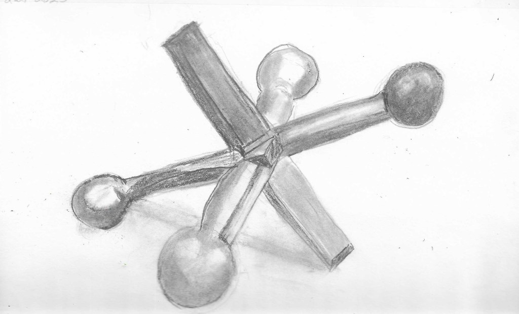
The proportions are somewhat off; the angles aren’t quite right, and my attempts at adding the “cast shadow” is just plain messy. All in all, though, it’s better than I expected it to be. I’d like to think that if I approached it with more patience, if I took a little more time to ensure my angles and proportions were accurate, maybe I could actually draw this little jack, or other similar objects.
But why did I decide to just put this drawing aside and not concern myself any further with shading and blending? Simply because, once again, when I look at this, all I see is messy drawing. I used a vinyl eraser and did my best to “clean up” the drawing. I tried to carefully erase around the edges of the spheres to ensure a crisper line. I tried to remove any smudge marks I’d made.
I struggle with this, though, and here’s why. We’re enouraged to draw lightly and loosely, and for me that means making lots and lots of lines. I see the point. Eventually I can look at all those lines and see where the correct lines should be. I can then go over those correct lines — as best I can — but I’m left with lots and lots of lines to erase. And the more lines I have to erase, the more of a mess I make.
I guess it’s still my shading and blending that give my drawings that “messy” look, so I’ll continue to work on those areas.
Yet despite my disappointment at making another little drawing mess, I can sit here and look at this jack and say “Well, you know, it turned out better than I’d expected.” It is a jack. Anyone, I think, can see it and say “Yes, that’s a jack.” Maybe a messy one, but a jack it is!
Which leaves me feeling a little hopeful. I can — and will — keep working on shading and blending. I can develop more patience and, in time, maybe get away from being so messy in my art. It’s good, at least, to have specific objectives I can work toward.

These were great to step on, lol
LikeLiked by 1 person
Oh, yes! Even worse than Lego blocks!
LikeLiked by 1 person
I like it! I seriously wouldn’t think twice about the “mess”–it just adds interesting texture to the drawings.
LikeLiked by 1 person
I know, for me, part of it is seeing it up close. If I step back and look at ifrom a distance, it looks better LOL. Shadows, though… they are still a problem. I’m working on them!
LikeLiked by 1 person
Shadows are the hardest. My hardest thing right now is to show, like, shadows on a red rose. What color do I use? Purple? That part is so hard for me… or what about shadows on a yellow rose? Green?
LikeLiked by 1 person
For the moment, I’ve given up on drawing shadows LOL. As I’m going through my 100 days of shapes and forms, I’ve really been wrestling with them. It’s easier for me to just concentrate on the shapes and forms. Once I get them right, maybe I’ll think about shadows again! And yes, choosing the right color… that’s another important aspect. One principle I remember from “color theory” is that shadows are cool and highights are warm, so we can use a “cool” version of a complementary color to create a shadow and a “warm” version of a complementary color for highlights. But then we also have to get the correct “value” — and yeah, shadows are hard!
LikeLike