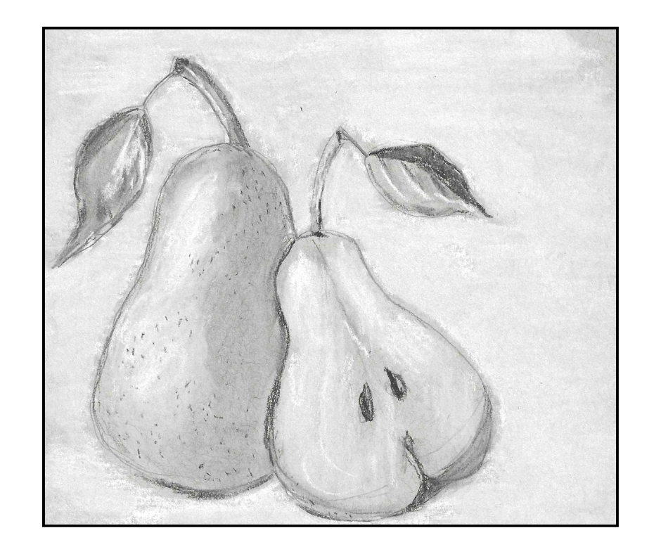
Just choosing a title for today’s post has been a challenge. This little charcoal study doesn’t deserve a lot of thoughtful consideration, really. It is what it is — a simple charcoal study, two speckled pears sitting side by side.
Yet trying to title this post most appropriately led to a lot of different thoughts. It’s a simple little study, yes, but for me — as a newly-re-evolving artist — this simple study led to a lot of thoughts.
First, in some ways, I see this study — the process of doing it — as a bit of “branching out” and becoming slightly more adventurous in my art. I drew not one, but two pears! I drew not only a whole pear, but a pear that’s cut in half, revealing its fleshy interior. I added leaves! It’s definitely a bit more complex than my tiresome single pear studies.
Second, I think I’m learning a lot from these simple studies, even if it doesn’t seem to show. I’m learning to use a lighter touch in drawing, in shading, and especially in blending. It doesn’t require much pressure to blend, especially with charcoal, the media I used for this study. I’m learning, too, that I can make changes when needed. Again, this may not be obvious in the study, but I added a few pencil lines after “completing” the study. The stems of the leaves had been almost lost. I tried to eliminate some of the “fuzziness” in the drawing. Even though it’s a charcoal study, I felt I could use my 4H graphite pencil to “fix things up” a bit, where necessary.
Third, let’s talk about that fuzziness. I guess charcoal can be “fuzzy” compared to other media, so that’s part of it. The real fuzziness comes from the white charcoal background I added. That was a challenge. I don’t like the fuzziness, but I’m not sure if it can be avoided, and if it can be, I’m not sure how to avoid it.
In the past, I enjoyed working on gray-toned paper, but with this drawing I didn’t enjoy it quite so much. As I’m working more on creating a full range of values, maybe I’d learn more by working on white paper so that I have to create all the values myself. Doing this study on gray paper just gave me a rather “gray”, gloomy feeling. Even with the white charcoal background — and highlights — the study looks a bit “sad” to me. In fact, as I look at that cut-pear with its two tear-shaped seeds, indeed, the drawing looks sad, almost as if it’s disappointed in me, too.
Of course, despite my best attempts, I still don’t have that full range of values. The flesh of the pear does not look significantly lighter than the skin of its neighbor. You can tell, of course, that I applied white charcoal and attempted to blend it, but when I blend the white charcoal onto the gray paper, it loses its whiteness and brightness. Do I then apply more? Do I blend again? Do I keep applying — and blending — more layers of white?
While I’m somewhat disappointed with the dreary feel of this little study, I’m also happy with it in a number of ways. Again, it does represent a “branching out” for me. I’m stepping away from very simple contour drawings, and as far as shapes and sizes, I did draw pears that look like pears. Even the leaves are “all right” — not great, but definitely leaves. The shading and blending, while still imperfect, shows that I have some grasp of the techniques involved. Mostly, though, I’m happy with this study because it shows that I’m not giving up. I’m practicing. I’m learning. I’m doing art again.
It’s been years since I’ve done any charcoal drawing, so I think I have reason to be pleased with this little study. I hope you find something about it to like, as well. It’s a step forward for me, and as I say so often about my art, “Hey, it could be worse!”

I love this sketch. It is an exercise in minimalism, something I can’t get my fingers around. I admit I’m not a busy artist — more like a dabbler. And sketching realism is something I’ve never accomplished. I hear everything you say about what you’ve learned doing it — and encourage you to continue your exploration!!
LikeLiked by 1 person
Thanks. It’s been an interesting little adventure trying to re-learn and/or “learn better”. 🙂
LikeLike
The core looks great–and you’ve managed to make the pears look juicy!
LikeLiked by 1 person
Thanks. At least it was something a little different from my previous pears.
LikeLiked by 1 person
Very nice! I really like these two pears. It is fun going along with you on these sketching adventures!
LikeLiked by 1 person
Thanks. I’m glad you like these pears. It really is an adenture, and I’m delighted to have you along!
LikeLiked by 1 person